Typography Isn't Dead, Just Needs to Be Correct
Enhance your visuals
Digital Design
Focusing on creating elements to convey your message more clearer. Facebook banners, logo icon work, website layouts even menu creation all fall into pieces to the big puzzle.
Having them coherent and clear so that each consumer can navigate or obtain the information as easily as possible.
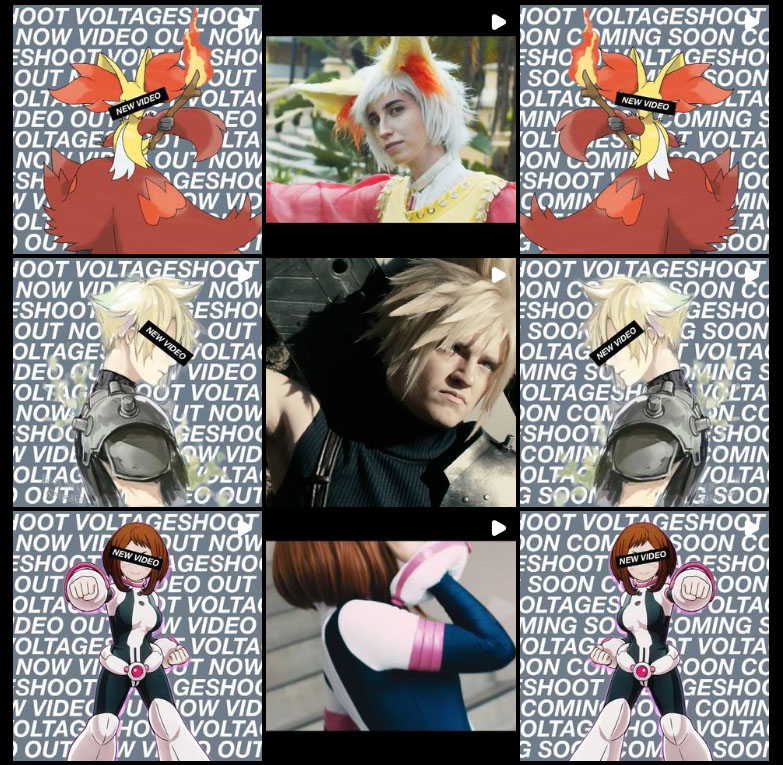
The 1:1 Format

Stylized
Screen sizes, monitors have steered away from ratio leaving opportunity to create a statement.

Utility versatile
Consistent in any orientation viewed at. Also translated to photo in many social media platforms.
Integration
Past formatting translated to handheld mobile devices this ratio is being adopted and future proof.
